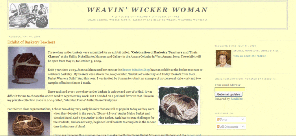
Well, as you have probably noticed, if you’ve viewed my website or blog over the last few days, we’ve made some changes to the template.
It’s stayed pretty much the same with the three-column template for the last five years, ever since 2007, when I switched my site platform to WordPress self-hosted.
Now you’ll see only two-columns with a different navigation system located at the top instead of along the left side. Hopefully, these changes will be to everyone’s benefit, making the site more user-friendly and at the same time, still providing all the FREE resources and information you are seeking.
- The navigation bar widgets on the left have been removed
- Navigation is now at the top with a drop-down menu
- Navigation links are also still at the bottom of every page
- Sitemap is at the top and bottom menu, in case you get lost and need to find a specific page
- Blog Subscription box is still on the right on both site pages as well as blog
- Shareaholic banner is at both the top and bottom of pages and blog post
- Please pass on and share interesting pages and blog posts to your friends through Shareaholic
Well, that’s pretty much it for this post, except I’d like to get your input as far as these template changes go. And please excuse us and let us know if there’s something not working quite right as we make these transitions.
Leave your comments below here on the blog or go to the Contact Us page to send your thoughts. Thanks a bunch, hope you are enjoying the changes.
[signoff]


I like the transitioning slideshow. Was that there before? The only thing I would say is maybe increasing the font size for the post title. But I have my settings to display small but I think before your titles were a little larger so they stood out. Love all the info you provide! I’m still not switched over to WordPress. I’m still working on the design. Oy!
Lynne
Thanks for your input Lynn, and yes the slideshow was there before, I just switched the location of it on the sidebar. I thought the blog title font was a bit on the small size too, but now I know for sure it is and will change it. Thanks again for taking time to comment, I appreciate it. Good luck on your blog migration, it’s quite a job for sure.